Webflow Design Agency
Get A Stunning, Responsive Website That Makes Money While You Sleep
Get a custom Webflow website for your service-based business that sells like a salesman who never sleeps.
")
Generate More Leads


You Deserve A Website That Brings In Leads 24/7
We Build Custom Webflow Websites Engineered For Lead Generation
Stunning Custom Websites
Take your brand to the next level with modern visual design and custom web development based on your specific needs.
Built-In Content Management System
Effortlessly manage content updates with Webflow CMS and custom templates. No extensive coding or in-house web designer required.
UX Design That Converts
Fast & Reliable Webflow Development
Fully Responsive & Mobile-Friendly
Dynamic Content and CMS Collections
SEO & Accessibility Optimization
Dedicated Webflow Experts
What Makes Us The Right Partner?
We’ve been in business since 2017. Over the years, we’ve served hundreds of clients – honing their messaging and design, creating amazing websites, and helping them grow.
Our work has been featured in a multi-million dollar online marketing course, a Wall Street Journal bestselling marketing book, and a YouTube review video viewed millions of times.
Our CEO, Alexander Toth, was previously a StoryBrand Certified Guide for over 6 years. He served as a coach at StoryBrand Workshops and coached new StoryBrand Guides.
But more than that, we help our clients grow. Including one of our Webflow clients who generated $1.5M in sales from his website within a period of 7 months.
Featured On


We’ve Helped Hundreds Of Companies Like Yours
ClearBrand Marketing Agency has served businesses with a variety of digital marketing needs in many industries. Our clients love that we regularly achieve better results than other marketing agencies were getting for them.
“
Results matter. Excuses don’t. ClearBrand delivers results.”

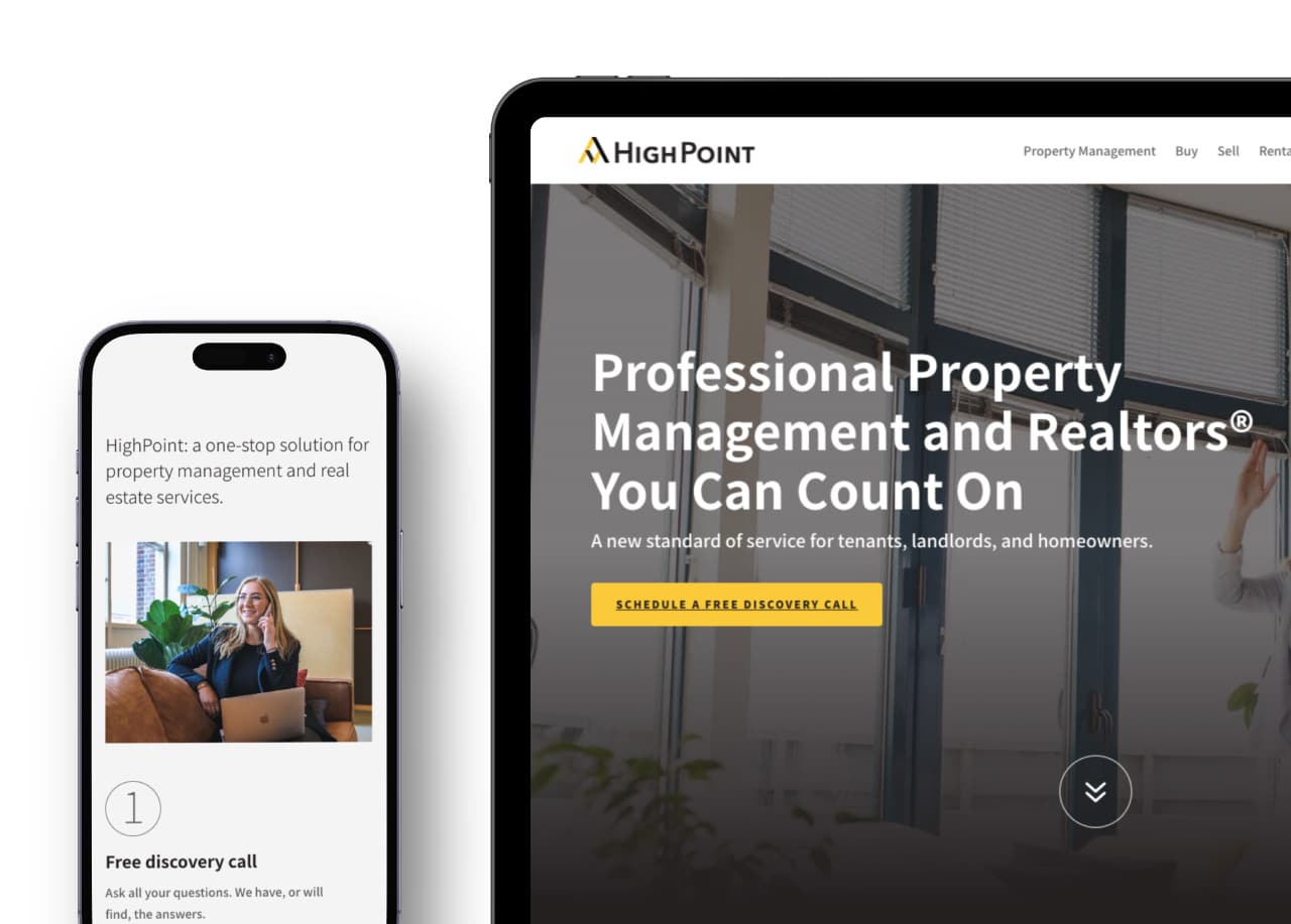
BRAD COEN, HIGHPOINT PROPERTY MANAGEMENT
Website
Website
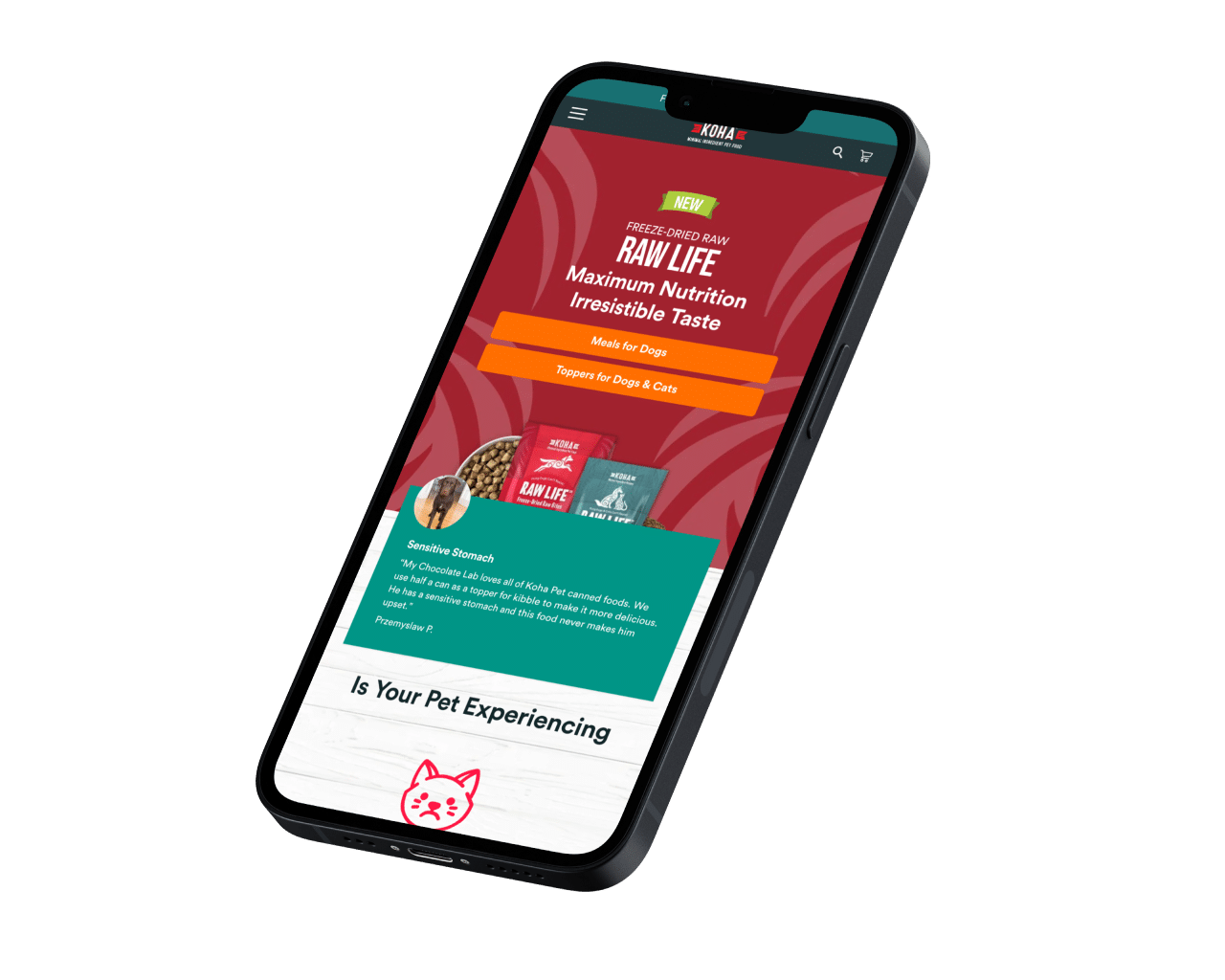
“
Money started raining in.”

Lonnie Schwimmer, CEO, Koha Pet
“
ClearBrand transformed the way we approach our marketing and gave us confidence in our ability to find and land new clients.”

Jason Graf, Executive Vice President, Zoë Facility Services
Digital Marketing

What You Get With Your Webflow Project
A visually striking, unique site and web copy that aligns perfectly with your brand.
Compelling Content
Our copywriters use the power of story to craft emotionally engaging messages that speak directly to your customers’ desires.
Easy Webflow CMS
We’ll teach you to use a simple, intuitive content management system that your entire team can use effortlessly.
Optimized For Leads & Conversions
Built-in marketing strategies that drive qualified leads directly to your inbox.
Schedule A Strategy Call With A Webflow Expert
In this call, we will:
Talk about the problems you’re experiencing
Show you more examples of our work