When your brand is all over the place, you scare off any clients because they can’t figure you out. Even worse, they can’t remember you.
They come to your website or see an ad, which is a win! But they need to see your brand multiple times to truly log you in their memory. And when your brand is inconsistent, you never build those memories. Which means next time your potential customer needs a product like yours, they’ll think of some other product. That potential sale is lost forever.
Clarity is key to helping your customers remember you. From your purpose to your visual brand identity, showing up cohesively wherever you are is the secret to staying on people’s minds.
Build a Memorable Brand So Clients Recognize You
It’s your job to make sure your customers understand how you help them succeed. Clearly communicating your purpose ensures that customers know what to expect from you, and helps them think of you when they’re looking for a solution to the problem your product solves.
To successfully brand yourself, you must start by deciding on your values, your purpose, and how these affect what you do. Then, shape those elements to create a solid visual aspect for your business or yourself.
1. Define Your Identity
When you don’t understand the reasons behind what you do, it’s easy to lose perspective and start getting vague. This lack of internal clarity shows up across your marketing and confuses your customers.
Dig into the motivation behind your offer to bridge the gap between what you’re trying to communicate and what people are perceiving. Connecting all of these dots allows you to shape your presence into a memorable experience for your customers.
Break down your brand into its essence, its core activity, and the reason behind it by asking yourself these questions:
Who are you?
What do you do?
Why do you do it?
Get specific so that you can have a solid foundation for your brand.
2. Be Clear About Your Purpose
Customers want clarity when they’re looking for a solution to their problems. Once you’ve clarified your reasons, it’s time to shape your purpose and start sharing it effectively so that people begin responding to your brand.
In order to clarify your purpose and be able to articulate it clearly, you need to ask yourself a few questions:
What is your core purpose? This is an aspirational statement.
How do you make the world a better place?
Why do you care?
Keep asking why until you’ve hit the root of your motivation. This is your message! Having a clear message helps you connect with your audience, and it helps your audience remember you and see why you add value to their lives.
3. Design a Consistent Visual Identity
Many business owners fall into the trap of using colors, shapes or fonts simply because they’re in trend at the moment. But doing this is almost a guaranteed failure down the line. If you’re seeing a color combo or font everywhere, your clients are, too.
This means that you don’t stand out because you look just like everyone else. You run the risk of becoming too generic. And chances are these trends don’t really relate to your brand or its tone very well.
Creating a solid image that’s consistent with your brand means that your initial efforts will last a long time.
Color
Many small businesses choose colors that don’t portray what they do. They’re inconsistent and go for trendy color combinations that end up making them look just like everyone else. The problem with this is that color is probably the first element people remember about a brand.
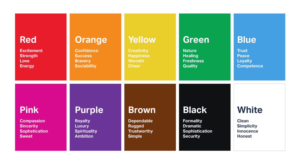
Here’s an easy guide to find the right colors for your business:
For example: yellow and orange are associated with energy and youthfulness. So we have brands like McDonald’s and Forever21 using yellow. And blue transmits honesty, comfort, and calm, so it’s common to see banks and hospitals with blue in their branding.
Choosing the right color for the tone of your brand is a great first step in creating a memorable image that people will come back to. The set decorators at Friends even confessed that the reason Monica’s apartment was purple was so that when people were flipping through channels they’d immediately recognize the show and tune in!
A Note on Color Contrast
An important thing to consider is that it can be hard to read certain color combinations online. This is especially true for people with visual disabilities and it can hurt your traffic because Google wants websites that any user will find useful, regardless of their visual impairments.
Using a simple dark background and a light font, or vice versa, is a good rule of thumb when you’re striving for contrast.
A page like color.a11y.com is a good resource to optimize your site and find the right shades so that visitors can read your content and stay for longer on your page.
Not only will this improve user experience, but it will also help your SEO in the long run.
Fonts
How many times have you scrolled through social media and seen some unreadable text in your feed? Or seen a logo and had no idea what it said? Selecting a font that doesn’t translate in different platforms makes it hard for people to remember who you are and where they’ve seen you before.
Create a connection in people’s brains and become memorable to them by using a font specifically for design elements like headings and even your logo, and combine it with a simpler, more readable font for the text in your platforms.
You can easily narrow down your choice by breaking down the main groups available:
Serif: These are the fonts with different decorative finishings in each letter. They’re often used for newspapers, banks, and more traditional institutions.
Sans Serif: Sans means without, so Sans Serif refers to a plain font in which the strokes of each letter don’t have an ornament at the ends. This is the easiest font to read and the one we encourage for most websites and modern brands.
Script: This style is made up of fonts that have a more natural, flowing shape and seem to be handwritten.

Decorative: This is a highly ornate font used as a signature style by many companies, and even for things like movie posters, video games and ads.
If your logo is your brand name, then you’ll likely use a decorative font for it. But that would be unreadable if you used in text for your site, social media, or stationery.
You can find ideas for font combos on sites like fontpair.co and fonts.com.
A great font or font combination is an easy way to set the tone for your entire brand and create a lasting impression in people’s minds. Think about big icons like Disney, Wikipedia, or even a TV show like How to Get Away with Murder. They all have a font that’s uniquely theirs and easy to read anywhere.
When you find a font you love — AND that your customers can read — you have confidence that your customers can easily engage with your brand. The right font can remove unnecessary friction between you and your customers. Making it easier for them to buy from you.
Logo
Maybe the hardest part of branding is designing a logo that communicates what you mean. After all, your logo is often the first contact between your customer and your brand. A bad logo prevents you from making a memorable impression with potential clients, and you end up missing opportunities because people can’t really place who you are in their minds.
Making your logo a minimal, versatile design is an easy way to adapt it to the different places it will show up in. A simple image combined with a nice font is a foolproof logo that you can tweak as you grow. For example, if you run a product-based business, something as simple as an outline of your product can become a memorable logo. And it’s common for people to choose a nice font and use the brand name or initials as a logo as well.
Keep in mind the different spaces where you could use your logo, and how it interacts with other elements. For example, for your website, you could choose to use the full logo with your company name, but choose a simplified version for stationery.
Be mindful of how you’re using these variables across platforms: using the same version of your logo in every platform helps your followers recognize you anywhere.
A great, memorable logo stays fresh in your clients’ minds, making it easier for them to turn to you the next time they need a solution.
Consistency Is Key to Memorability
Stop confusing potential customers with inconsistent design elements.
Build a strong, cohesive visual brand to make it easier for your customers to remember you. This sets you on the right track to growth.
Eliana Ifill,
Lead Copywriter


